
5 Psychology-Backed CTA Frameworks to Turn Views into Leads
Stop losing revenue to weak buttons. Master 5 psychology-backed CTA frameworks that exploit human bias to convert casual views into high-value leads.
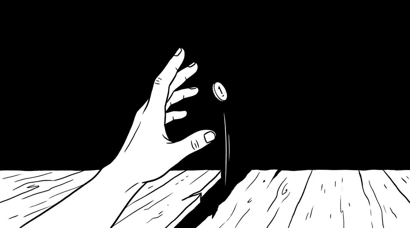
Your audience is smarter than you think. But they are also more predictable than you are willing to admit. You believe your content is a masterpiece. You think the value is so obvious that people will naturally seek out your contact form. You are wrong.
The average reader is drowning in a sea of digital noise. They are not looking for a reason to click. They are looking for a reason to leave. A call to action (CTA) is not a polite suggestion. It is a psychological bridge. If that bridge is flimsy, your traffic falls into the abyss of "maybe later."
The Myth of the Rational Clicker
Most marketers fall into one of two camps. The first camp believes in the "Logic Trap." They think that if they list enough features, the reader will perform a cost-benefit analysis and click. The second camp believes in the "Hype Trap." They use flashing buttons and aggressive timers to bully the reader into a lead.
The truth is found in the middle. Logic provides the justification. Emotion provides the impulse. This is the Synthesis Hook. A perfect CTA validates the reader's intelligence while triggering their primal biases.
The progression of a lead looks like this: Unconscious Need → Cognitive Friction → Pattern Recognition → Decisive Action.
Framework 1: The Zeigarnik Loop
You hate unfinished business. The human brain is hardwired to seek closure. When a task is incomplete, it creates a "mental itch" that can only be scratched by finishing the loop. This is the Zeigarnik Effect.
- The Tension: Introduce a specific problem but withhold the final step.
- The Gap: Clearly define what the reader is missing.
- The Resolution: Position the CTA as the only way to close the loop.
- The Reward: Immediate access to the missing piece of the puzzle.
Cognitive Closure The brain prioritizes incomplete tasks over completed ones. If you offer a "Part 1" of a strategy, the reader feels a physical need to see "Part 2."
Example: "You have the strategy. Click here to see the results of the 30-day test."
The pattern is clear: Curiosity is a more powerful motivator than information.
Framework 2: The Loss Aversion Pivot
You are not motivated by gain. You are terrified of loss. Psychologically, the pain of losing $100 is twice as potent as the joy of finding $100. Most CTAs focus on what the user will "Get." High-converting CTAs focus on what the user will "Stop Losing."
| Traditional Approach | Loss Aversion Approach |
|---|---|
| Join our newsletter for tips. | Stop wasting your marketing budget. |
| Download the guide to grow. | Avoid the 5 mistakes killing your reach. |
| Get a free consultation. | See where your funnel is leaking cash. |
Negative Framing Humans are evolutionarily designed to scan for threats. A "Benefit" is a luxury. A "Solution to a Loss" is a necessity.
Stop selling the ladder; start selling the escape from the pit.
Framework 3: The Benign Social Proof
You think you are an individual. In reality, you are a sheep looking for a shepherd. When we are uncertain, we look at the behavior of others to determine our own. This is Social Validation.
However, "Join 10,000 others" is a tired trope. To make it work today, you need Declarative Specificity.
- The Tribe: Define exactly who else is clicking.
- The Velocity: Show how fast the community is moving.
- The Exclusion: Imply that staying outside the group is a disadvantage.
- The Authority: Use a single, high-status name to anchor the crowd.
Social Anchoring We don't just want what others have. We want what people we respect have.
Example: "Join 450+ Senior Engineers who use this daily."
Validation kills the fear of making a wrong decision.
Framework 4: The Micro-Commitment Ladder
You are asking for marriage on the first date. A "Sign Up Now" button for a high-ticket service is an act of aggression. The brain perceives a large request as a threat to its resources. You must use the Consistency Principle.
The goal is to get a "Yes" to a small, effortless request. Once a person says "Yes" once, they are cognitively biased to say "Yes" again to remain consistent.
A → B → C → D Interactive Quiz → Email for Results → Resource Download → Discovery Call.
Low-Friction Entry Start with a question. Move to a click. End with a form.
Example: Instead of "Book a Demo," use "Check your site's health score."
Small wins build the momentum required for big commitments.
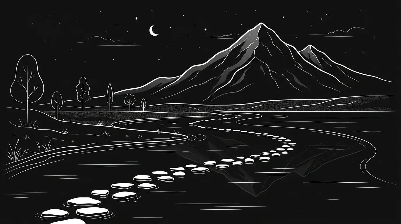
Framework 5: The Goal-Gradient Effect
The closer you are to the finish line, the faster you run. If a user feels they have already started the process, they are more likely to finish it. This is why progress bars are so effective. You need to make the reader feel like they are already 50% of the way there.
Pre-Fill Logic Give the reader "credit" for the work they have already done by reading your article.
- The Setup: "You’ve already learned the theory."
- The Progress: "You are one step away from the template."
- The Action: "Complete the final 10% here."
- The Finish: Instant gratification upon clicking.
Artificial Advancement A loyalty card with two stamps already on it gets filled faster than an empty one. Your CTA should feel like the "Final Stamp."
Example: "You've read the guide. Now, click to apply the checklist."
Action is easier when the finish line is in sight.
Execution: The Anatomy of a High-Converting Button
You can have the best psychology in the world, but if the design is cluttered, you will fail. The eye follows the path of least resistance.
Visual Hierarchy The button must be the most visually "heavy" object on the screen.
- High Contrast: Use colors that do not appear anywhere else in your brand palette.
- Whitespace Buffer: Surround the CTA with nothingness to force the eye inward.
- Action Verbs: Use words that imply physical movement (Grab, Start, Claim).
- First Person: "Start my free trial" outperforms "Start your free trial."

The Conversion Conclusion
Frameworks are not magic spells. They are mirrors that reflect how the human brain actually processes information. If you continue to treat your audience as a collection of data points, your conversion rate will reflect that coldness. If you treat them as biological entities driven by fear, social pressure, and the need for closure, you will win.
Stop guessing what will work. The pattern of human behavior has not changed in ten thousand years. Only the screens have.
The Key Takeaways:
- Close the loop to trigger curiosity.
- Highlight what is being lost, not just what is gained.
- Use specific social proof to anchor trust.
- Build a ladder of small "Yeses" before asking for the "Big Yes."
- Position your CTA as the final step of a journey already begun.
Your views are a vanity metric until they are converted into a conversation.